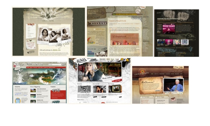
I found this design the hardest to get started on as the pared down simple design seemed harder to do effectively without the result looking boring and un-enticing. Because the products on the site I have re-word are all quite colourful, I felt the design needed to use a limited palette, while at the same time still appealing to the right audience. Below is the mood board I used as my initial inspiration:

I liked the clean simple look of these and initially came up with the following design:

I felt this was a little too clinical, perhaps suitable for selling surgical instruments. For my second attempt i decided to add a bit of colour to appeal to the creative audience with the following result.

Well it was certainly more colourful, but a bit too harsh looking still. For the final design I reduced the opacity of the colours and added a layer blend so that it appeared like coloured filters.